So much of accessibility testing seems subjective. (What exactly does “visible” mean?) This article uses real websites to demonstrate examples of good—and poor—accessibility. It’s up to the tester to advocate for users, so it’s essential to know what elements need to be checked and how to confirm that they are promoting accessibility.
Digital accessibility refers to assistive technologies as well as to accessibility of web and mobile applications and electronic documents.
The notion of “accessibility” is multi-faceted and broadly interpreted. In an unfortunate view it’s degraded merely to the ability to open a document or connect to a website. But in the customer-oriented view, accessibility means ensuring that people with disabilities have the same convenience and quality of user experience as anyone else.
However, the ways customers navigate and operate the software product may vary depending on the cognitive, motoric, and habitual characteristics of their interaction with software. It also depends on users’ knowledge of domains, experience with particular products, and skill level in using assistive technologies in particular and information technologies in general.
In order to provide a high-quality user experience, we need to understand the ways users operate software and perceive information.
Bringing Accessibility into Focus
Do you see a problem in the image below?

Can you see the focused link at all? If you can, is it easily distinguishable? Could you instantly find the focused element if you didn’t know where to look for it?
If you answered no to any of the above, you just spotted an accessibility problem.
The Web Content Accessibility Guidelines (WCAG) mandate that the application must be navigable with a keyboard only and that the focus indicator be clearly visible: “People with attention limitations, short-term memory limitations, or limitations in executive processes benefit by being able to discover where the focus is located.”
In order to narrow down the subjective criterion of visibility, the WCAG has references to color, contrast, and sensory characteristics to specify that requirement. Web developers understanding “the spirit of the law” manage to highlight focus in much better ways than a default rectangle.
Here’s an example from the WCAG website itself:

The particular problem with default focus is that it can be displayed differently by different browsers, or even different versions of the same browser. Even if a testing device or browser display default focus in a clearly visible fashion, end-users may experience problems on their devices.
Custom highlighting of the focus is a fairly simple trick, and the Internet is full of CSS code examples. However, widgets and frameworks must allow such customization. If a website has a complex structure, each representative must be taken care of.
This is also a testing problem. How long will it take to tabulate the focus through every single control on every single webpage, on all combinations of the popular browsers and their versions? And new browser versions come out very often.
Tools can’t help with this problem. To my knowledge, there’s no single tool available that can automatically TAB through the controls and register color and contrast ratio for the focus.
Let’s look at another example.

The focus is on the link. Can you see it? (It’s the thingy in the top right corner).
How will you advocate for that impact? The focus is a small feature, but it’s a big deal because it is constantly used. While not impacting all users, it might be detrimental for the user experience of people relying on clearly identifiable keyboard focus. Even though it does not block the functionality per se, the affected users will experience continuous frustration.
Looking beyond Visual Elements
No one really reads a whole webpage, especially when looking for something specific. You’re screening—also called scanning or skimming. Fully understanding the text isn’t important here; the advantage is in very fast processing of the information.
First of all, you want to know if you’re on the wrong page. If you are, you move on. Then you scan through the page, usually jumping through to what catches your attention: images, headings, large or colored text, or important keywords. You may jump forward and backward. If something draws the focus of your attention, you slow down a bit and scan that area. Then, if you decide you found what you wanted, you read that section more attentively. The scanning process happens in just a few seconds.
Screen reader software can do a scan for precoded patterns (like H tags for headings) and bring them back to the user. It takes a fraction of second to scan; then the list can be read to the user. Users can also go forward and backward through the list, or instruct their screen readers to “jump” (set the reading focus) into the heading of their interest, and then read that section.
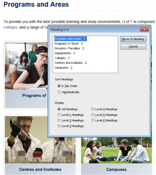
The image below shows a page with accessible sections through headings, with the JAWS screen reader window processing them on top.

Note that the screen reader took the hierarchy and tab order into account, giving “Programs and Areas” a level 1 heading and the other sections level 2 headings.
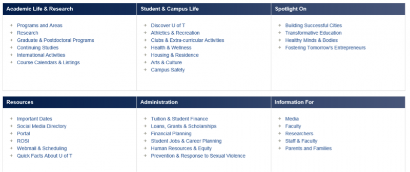
Now look at this page:

Here’s the problem: Headings in this example visually look like headings, but they were not encoded in HTML as headings—so they wouldn’t be found by a screen reader. And that makes scanning inaccessible. Going through that very busy page becomes a slow and painful process.
WCAG has a number of requirements dedicated to a page’s information, structure, and relationships, explaining how elements should be organized to enable accessible reading and accessible scanning. Testing tools can help, but they can only check whether the H tags structure is hierarchic. They can’t identify missing tags or notice that headings don’t correspond to the sections’ contents.
We need to discover elements beyond visual decorations like font styles, images, and white space, and become consciously aware of how people scan. An accessible page needs to be well structured, and the structure needs to be encoded with the right use of HTML elements.
Advocating for Real Accessibility Is the Tester’s Responsibility
Tools cannot find many important problems. In particular, it’s impossible to use tools to match meaning of headings with the meaning of the content, or to identify where visual styling was used in lieu of proper coding. Tools also can’t evaluate complexity and consistency of webpage structure, which is the key to accessible scanning.
Instead, it’s the tester’s responsibility to know what elements need to be checked and how to confirm that they enable accessibility.
Testers must be included in the early stages of design and prototyping, but they cannot take solely a “test early” approach in accessibility testing; visual inspection of mock-ups won’t uncover defects in HTML implementation. That means that in addition to testers knowing how to operate screen readers to simulate the experience of nonsighted users, they also need to be able to read HTML and be familiar with accessibility patterns.
With the constant changes in technology and in usage patterns, testers need to keep up with their technical skills and testing techniques. Refer to the WCAG for help, and if in doubt, error toward greater accessibility. It’s up to us to be advocates for our users.

