The concept that software should be usable by the widest possible audience has been around for more than twenty years, yet for quite a while it remained out of the mainstream of testing and development efforts.
This has been changing in recent years. We have seen diversity and digital inclusion become social priorities. On top of the implied social contract, we also now have explicit legal contracts, such as Section 508 of the Rehabilitation Act in the US and Canadian provincial legislations (AODA in Ontario, Quebec Standards for Accessibility, and others), which define accessibility standards for government and public sector software. This sets a trending example for the overall market.
Just like designers, business analysts, and programmers, testers need to acquire new professional skills in the accessibility domain.
Digital accessibility refers to not only ease of use within web browsers for those with visual, auditory, or motor disabilities, but also software supported by users' assistive technologies. Using tools to identify accessibility problems is a popular approach, but it has hidden pitfalls. Accessibility at large is about human perception, cognition, and interaction, and those aspects are hardly detectable by mechanistic means. Here, let’s look at accessibility testing tools by category, highlighting their advantages and risks.
Why Tools Are Essential for Accessibility Testing
Testers recognize problems with software based on their mental models, experiences, and feelings. But how can we test a product effectively on behalf someone with different perceptions and mental models?
One way is learning accessibility-specific oracles—effectively, heuristic principles—in order to be able to recognize and classify barriers that may be encountered by people with disabilities. Another important method is employing tools to alter your own perception and cognition so you can model the usage patterns of your customers.
The ways customers navigate and operate the software product may vary depending on the cognitive, motoric, and habitual characteristics of their interaction with the software. It also depends on users’ knowledge of domains, experience with particular products, and skill level in using assistive technologies in particular and information technologies in general. That asks for a variety of tools to be employed by testers.
Accessibility testing tools include those specifically created to identify defects as well as regular assistive technologies used by testers in the same way as people with disabilities. Let’s look at some of the most popular tools.
Screen Readers
People with vision impairment use screen readers, software programs that read the text displayed on a screen using a speech synthesizer or Braille display. The user can send commands by pressing different combinations of keys to instruct the speech synthesizer what to say, to read or spell a word or full screen of text, announce the location of the computer's cursor, and more.
Screen readers are available as commercial and as free or open source software (such as popular English-speaking options JAWS and NVDA), and there are also built-in options for Windows, macOS, iOS, and Android.
Screen readers are not testing tools by intent, but they are invaluable for accessibility testers to simulate their users’ experience firsthand.
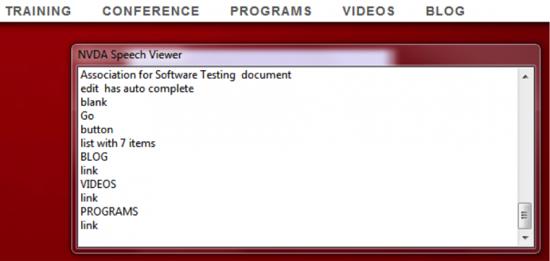
Some screen readers come with useful features like a speech log, which helps testers identify problems and back up bug reports. In the example below, the free and open source screen reader NVDA shows through its speech viewer that the website’s dictated tab order does not match visual order—the tabs are supposed to be ordered left to right, but with keyboard-only operation, users get right to left, with “Blog” given first.

HTML-Checking Tools
As the name suggests, HTML-checking tools scan webpages’ content and check syntax against the rules encoded in them. The rules are all based on the international standard Web Content Accessibility Guidelines, or WCAG.
There’s a wide variety of these tools on the market, with free and open source options as well as pricey enterprise products. They are available as standalone applications (such as SortSite), online applications (AChecker and WAVE), API integrations (Tenon), and various browser add-ons (WAVE also has a toolbar).
This class of tools is useful for a quick search of “low-hanging fruits” such as obvious problems caused by missing HTML elements needed for accessibility. For example, if an image doesn’t have an associated textual alternative, or alt text, a tool will flag it.
However, the tool still requires a human to decide whether the alternative text adequately describes the image in the particular context. A tool also won’t distinguish between an image used just for visual decoration, which should have empty alt text, and an illustration image that must have meaningful alt text.
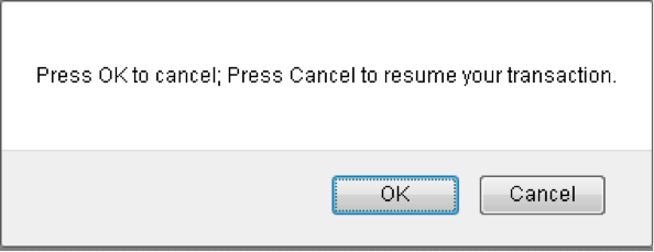
In fact, anything concerning adequacy of the user interface requires human evaluation. For example, this screen shot of a modal dialog has no HTML violations, but there are obvious usability problems relating to understanding this message.

Typically, HTML-checking tools evaluate a single webpage or website. They don’t have the ability to automatically navigate a web application because that requires data input and user actions. They also do not provide full coverage of all WCAG criteria and they do not catch all problems for any criteria.
Color and Contrast Checkers
Some people cannot distinguish between certain colors. They may not need special assistive technologies, but due to this difficulty, a user interface should not rely solely on color to convey information. Additionally, for people who have epilepsy that is photosensitive, flickering or flashing lights can trigger seizures, so these elements should not be used on websites, either.
Color and contrast checkers can help detect these elements that could be problematic. As the name implies, this family of tools is used to verify color code and contrast ratio. Typically, they require a tester to manually select the color of the background and foreground in order to calculate the ratio.
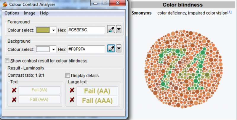
In this example, the Colour Contrast Analyser tool evaluates the image from the Wikipedia page on color blindness and, predictably, shows that the text fails the tests.

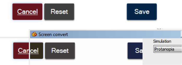
More advanced tools may include a simulation mode to give testers a firsthand perception experience, so they’ll know what their users would see. Below, the same tool in simulation mode shows that the red Cancel button would be indistinguishable from the gray Reset button for people with protanopia, or red-green color blindness.

GUI Automation Tools
Regular GUI automation tools, such as Unified Functional Testing (UFT) or Selenium, can be successfully employed for regression testing with partial coverage of accessibility requirements. Because GUI automation tools do interact and navigate web applications, sometimes it is viable to incorporate custom checkpoints to overcome limitations of generic accessibility checkers. Verification of accessibility features in HTML is not different from verification of ID, labels, and other elements routinely verified via GUI automation.
Readability Analyzers
For people who have a limited ability to process and memorize information, make decisions, or pay attention for an extended period of time, overly complex language can be confusing or frustrating. This category also includes people in stressful or distracting conditions or who are not fluent in the language. To assist these users, software should present information in a clear and organized manner, remind people about important points, and allow verifying and correcting. These characteristics together are known as readability.
There are linguistic methods to calculate the complexity index of a written text (for example, the Gunning fog index or the Flesch–Kincaid readability test). The index estimates the years of formal education a person needs to understand the text on the first reading, and this can be tied to a level of cognitive effort. There are free online tools for text evaluation based on these and other criteria. As with other mechanistic means, you can’t rely on these tools alone—a human verification is still preferable—but they are useful for a quick, rough check to flag potentially problematic language.
Ordinary Tools
People with low vision, defocused vision, or spot vision may not need to use screen readers but would still like assistance in reading text. They may use the zoom feature in a browser, reduce screen resolution, or increase font size, contrast levels, and color polarity.
People who temporarily or permanently do not have a desired control of their body, especially their arms or hands, may use a variety of physical and electronic assistive technologies, but in terms of software operation, it comes down to a keyboard-only usage pattern without the aid of a mouse.
These options do not require any special testing tools. For example, the ability to navigate through an entire web page using a keyboard only (tab and shift-tab) is a basic level of compliance. While “tabbing through,” testers also should check that the focus is always visible and well distinguishable.
Other useful tools for testers already are built into the browsers. Pressing F12 opens the Inspect mode, allowing testers to check the HTML source of a UI element in question.
In the example below, alt text for the images was highlighted using the Web Developer toolbar, and we have examples of both sufficient and inappropriate textual descriptions.

Such browser tools may not specifically point to accessibility problems, but they still greatly help testers find them.
Add to Your Toolkit
A software tester’s accessibility testing toolkit should contain various tools, both to help testers “walk in the shoes” of their users and experience what they experience, and to quickly flag obvious problems and expose accessibility features (or a lack of them). As in every aspect of skilled testing, high performance is only achievable with deep engagement of human skills, not a reliance on tools, but these will help you uncover potential issues and make your product a better user experience for a wider audience.


User Comments
Very elaborated and useful information.
Thanks for sharing such a useful information.